My Love Letter to "Photographic Style" on iPhone 16
-
Stage
Information about stage Sapling
- Created
Apple announced a 2nd-generation Photographic Style with their iPhone 16 lineup in September. I just got an Aquamarine iPhone 16, and I love this feature even more than the Camera Control. Let me explain why.

What is Photographic Style
As Apple likes to put it… it’s to customize the look of your photos. And to tell you the truth, I think they are avoiding the word “filter.” But I kinda think they are… right?
So on every iPhone and iPad, exists the Computational Photography pipeline, they process data from the camera sensor. They detect the bright areas, dark areas, and even skin tones. This pipeline applies different adjustments to each area. This enables iPhone to up their game, getting as close to normal large cameras, like those mirrorless ones, with exceptional detail and clarity, but in a small form factor.
And this Photographic Style comes into play at the end of the pipeline (as Apple has said).
The Competition, Processed vs. RAW Image
In digital photography, a camera can store two main formats of a photo: a processed file and a RAW file.
A processed file is what we are familiar with, be it JPEG, PNG, or even the newer format of HEIF/HEIC. These processed files are small in size, with a trade-off in quality. The photo doesn’t preserve much data for post-processing. For example, we might want to adjust brightness after we shot a photo, but in a processed file, bringing the brightness up might not work. The dark parts are already “baked into” the photo file. Bringing those part up will just yield an JPEG artifacts (pixel-ly areas)
For Apple, they use HEIC on iPhone, selling it under the “High Efficiency” format. This format allows this Photographic Style to shine… in two areas.
Two Reasons Why I Like This Feature
The main big reason is that it’s not “baked-in,” and I can always adjust it later in the Photos App. This strikes the balance between “wanting to keep every detail” (in RAW photos) vs. “wanting to save space” (in processed photos). Because that’s where I’m at—I don’t want to spend storage space to keep RAW images, PLUS the time to process all the RAW files. I want a file that I can edit, but with low space usage.
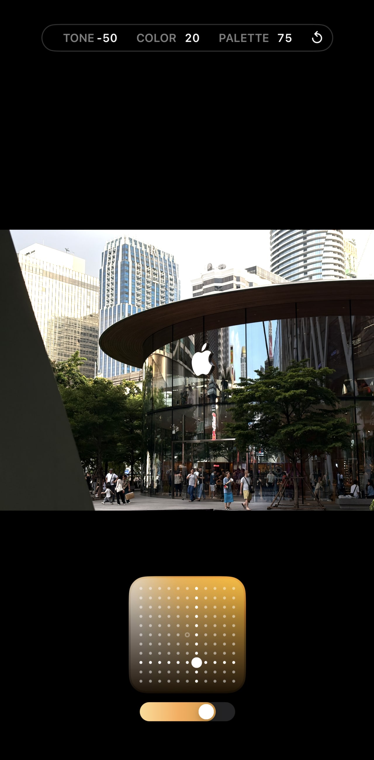
The other reason is that with Apple’s image processing pipeline, it understands where skin tone is, and the Style can apply accordingly. There are three main parameters under a style: Tone, Color, and Palette. And with intuitive control using a 2D space and a slider, I can dial in the perfect amount of style that I want.
- Tone: controls the contrast of an image. A negative value (bottom part of the 2D space) gives a more contrasty result like a normal camera.
- Color: controls the “saturation”-per-se of an image. A negative value (left part of the 2D space) gives a more muted color.
- Palette: controls the strength of the “Style.” A high value makes the style more impactful on the image.
How I Use It
I like the “Gold” Photographic Style, with -50 Tone, 20 Color, and 75 Palette. I think it strikes a balance for a digital camera feel, and it gives a “golden” tone, similar to the Kodak film roll I used to shoot with. But not too much into the film-level contrast.


